
Data Science Weekly - Issue 602
Curated news, articles and jobs related to Data Science, AI, & Machine Learning

Issue #602
June 05, 2025
Hello!
Once a week, we write this email to share the links we thought were worth sharing in the Data Science, ML, AI, Data Visualization, and ML/Data Engineering worlds.
And now…let's dive into some interesting links from this week.
Editor's Picks
How large should your sample size be?
“How much of this massive amount of data that we’ve collected can we throw out and still be accurate?” That was the question I was trying to answer a couple weeks ago when I was working with a SQL table that had grown to 1+ billion rows…
I Made Our System 30% Faster by Actually Reading the Docs (Kafka + Elasticsearch Speedrun)
So our data ingestion was basically trash. Like, embarrassingly bad. We were processing messages one by one like it's 2010, and our Elasticsearch was crying every time we sent it a single document. Classic rookie mistake, but hey, we've all been there…The problem? We were being inefficient AF. Every single message from Kafka was getting processed individually, and every document was hitting Elasticsearch solo. That's like... ordering one item at a time from Amazon instead of filling up your cart. Just painful to watch…So I did what any reasonable dev would do - I RTFM'd and actually implemented batching properly…The Illusion of Causality in Charts
How charts can mislead us by depicting causes that may not exist…A while back, I wrote an article here titled “Implied Causality in Line Charts.” The article examined the notion that certain charts imply a causal relationship between an event and an outcome, when such a relationship may not actually exist. In that post, I used line charts as a running example…When I finished writing that post on line charts, I knew that I wanted to generalize the idea to a much broader set of charts and that some overarching principles must exist that cover most, if not all, charts. After several months, I now feel ready to make some advancements. In this post, I’ll start from where I stopped to include more charts and attempt to generalize this idea to any chart…
What’s on your mind
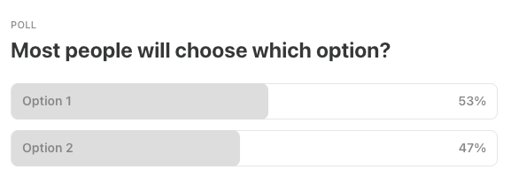
This Week’s Poll:
Last Week’s Poll:
.
Data Science Articles & Videos
Optimizing Defensive Matchups Using Machine Learning
My goal for this project was to develop a model that identifies the optimal physical attributes needed to minimize offensive production against each offensive player in the NBA. Then, I identified the current player whose attributes most closely align with these optimal dimensions, making them the best candidate to effectively defend the opposing player…How do you push back on endless “urgent” data requests? [Reddit]
“I just need a quick number…” “Can you add this column?” “Why does the dashboard not match what I saw in my spreadsheet?” At some point, I just gave up. But I’m wondering, have any of you found ways to push back without sounding like you’re blocking progress?…LLM Inference Economics from First Principles
The main product LLM companies offer these days is access to their models via an API, and the key question that will determine the profitability they can enjoy is the inference cost structure…In this text we will explain where the cost of serving/hosting LLMs comes from, how many tokens can be produced by a GPU, and why this is the case. We will build a (simplified) world model of LLM inference arithmetics, based on the popular open-source model-LLama 3.3. The goal is to develop an accurate intuition regarding LLM inference…Statistical Rethinking (2024 Edition)
This course teaches data analysis, but it focuses on scientific models. The unfortunate truth about data is that nothing much can be done with it, until we say what caused it. We will prioritize conceptual, causal models and precise questions about those models. We will use Bayesian data analysis to connect scientific models to evidence. And we will learn powerful computational tools for coping with high-dimension, imperfect data of the kind that biologists and social scientists face…Top 50 Large Language Model (LLM) Interview Questions [Google Drive]
This document compiles 50 essential interview questions, carefully curated to deepen your understanding of LLMs. Each question is paired with a detailed answer, blending technical insights with practical examples…How The Heck Do QR Codes Work?
This page is an interactive primer on QR codes. We'll explore the parts of a QR code. A lot of this gets pretty technical, but we'll keep it as high-level as possible and link to more in-depth resources for those who want to dive deeper. To start, let's look at some QR codes. You can type in the text you want to encode in the input box below, and the QR code will update in real-time. The parts of the code are labeled, and we'll dive into each part in detail below…What Does It Mean to “Control” in Regression Analysis?
In statistical analysis, “controlling” for a variable means accounting for its effect when examining the relationship between other variables. This helps us understand the true relationship between an independent variable (X) and a dependent variable (Y) by removing the influence of potentially confounding factors (Z). As a result, when we interpret the coefficient of X, we can say “after considering the relationship between Z and X as well as Z and Y, the estimated effect of X on Y is…”…freq - A tool for counting frequency of items and showing related statistics
Over the years, I’ve found myself doing a lot of ad-hoc data analysis with shell pipelines involvinggrep,sed,awk,sort,uniq -c, andsort -rnto look at distributions of values in datasets. I wrotefreqto streamline these tasks, and I use it daily…It has feature flags to enable transparent decompression of several file types, and also regular expression filtering/munging support…A list of 99 machine learning projects for anyone interested to learn machine learning from coding and building projects. Our working philosophy is to provide a curated repo for anyone to contribute a cool/fun exercise and solution that is useful for anyone (including themselves) in their journey of learning machine learning…
The cowplot package is a simple add-on to ggplot. It provides various features that help with creating publication-quality figures, such as a set of themes, functions to align plots and arrange them into complex compound figures, and functions that make it easy to annotate plots and or mix plots with images. The package was originally written for internal use in my lab, to provide my students and postdocs with the tools to make high-quality figures for their publications. I have also used the package extensively in my book Fundamentals of Data Visualization. This introductory vignette provides a brief glance at the key features of the package…
Why Gradients Rapidly Increase Near the End of Training
During long-duration Large Language Model (LLM) training runs the gradient norm increases rapidly near the end of training. In this short note, we show that this increase is due to an unintended interaction between weight decay, normalization layers, and the learning rate schedule. We propose a simple correction that fixes this behavior while also resulting in lower loss values throughout training…How do you teach business common sense? [Reddit]
Really not the best way to start the week by finding out a colleague of mine CC'ed our internal-only model run reports to downstream team, which then triggered a chain of ppl requesting to be CC'ed for any future delivery…This person works hard, has good intention, and can deliver if correctly understanding the task (which is in itself another battle). I'm not his manager, but he takes over the processes/pipelines I established so I'm still on the hook if things don't work. I trust his work on the technical side but this corporate thing is really not clicking for him, and I really have no idea how do you put these "common sense" into someone's head…Integrating webR with Laravel Livewire: How I made my ggplot2 Gallery with WebAssembly
For me, building my website has always been driven largely by a motivation to share data visualizations made with R. I have had the ability to share articles featuring charts that I author in RStudio or Observable notebooks. I also have had a page where you can see screenshots (w/links) of some of my Shiny apps. But until recently, there was a natural need for something enabling a quicker, interactive way to share fun stuff I come across without writing out a full article or Shiny app…
.
Last Week's Newsletter's 3 Most Clicked Links
.
* Based on unique clicks.
** Find last week's issue #601 here.
Cutting Room Floor
Top 15 ggplot2 extensions, by downloads during the last month [Twitter/X]
How Often is AI Depicted in Movies, and How Frequently is it the Villain? A Statistical Analysis
.
Whenever you're ready, 3 ways we can help:
Want to get better at Data Science / Machine Learning Math? I have a zero weekly tutoring slots open. Hit reply to this email and let me know what you want to learn. I’ll add you to the waitlist.
Looking to get a job? Check out our “Get A Data Science Job” Course
It is a comprehensive course that teaches you everything related to getting a data science job based on answers to thousands of emails from readers like you. The course has 3 sections: Section 1 covers how to get started, Section 2 covers how to assemble a portfolio to showcase your experience (even if you don’t have any), and Section 3 covers how to write your resume.Promote yourself/organization to ~68,400 subscribers by sponsoring this newsletter. 30-40% weekly open rate.
Thank you for joining us this week! :)
Stay Data Science-y!
All our best,
Hannah & Sebastian