
Data Science Weekly - Issue 639
Curated news, articles and jobs related to Data Science, AI, & Machine Learning

Issue #639
February 19, 2026
Hello!
Once a week, we write this email to share the links we thought were worth sharing in the Data Science, ML, AI, Data Visualization, and ML/Data Engineering worlds.
Sponsor Message
Think of Otio as a Google Drive with an AI built in.

The bottleneck isn’t access to information - it’s synthesis. Thirty tabs, a dozen reports, scattered spreadsheets, a handful of half-read articles, and all of it needs to become a deliverable by Friday.
Otio.ai is a research workspace where everything lives in one place - upload directly or connect your Google Drive. Unlimited storage, no file juggling.
Drop in a CSV and start making sense of your data. Otio analyses it, generates visualisations, and lets you chat across it, alongside every other source - using any AI model (Claude, GPT, Gemini, DeepSeek, Grok). Switch models without re-uploading and find every answer source-grounded with verifiable citations.
Finally, turn answers into exportable deliverables - reports, presentations, documents - directly from your material. 200,000+ researchers, analysts, and consultants use Otio to go from raw data to finished work.
Try Otio free - chat with your data, visualise it, deliver it.
.
And now…let’s dive into some interesting links from this week.
Editor's Picks
Computers can be understood
This post attempts to describe a mindset I’ve come to realize I bring to essentially all of my work with software. I attempt to articulate this mindset, some of its implications and strengths, and some of the ways in which it’s lead me astray…
How to stay in control when doing EDA with coding agents
In this blog post, I share how coding agents can supercharge data analysis, but only if we stay in control. By slowing down, asking the right questions, and structuring sessions with journals and artifact gating, we avoid chaos and keep our scientific thinking sharp. I explain the skills and patterns that help teams focus on insights rather than just generating code…How Video Podcasts Took Over Streaming: A Statistical Analysis
The rise of video podcasting has reshaped the entertainment landscape, prompting platforms like Netflix and Spotify to embrace this hybrid format. Once again, tech platforms are pivoting to video, taking content built for ears and retrofitting it with a visual dimension. My decidedly uncool brain cannot make sense of this trend—which means a full-fledged investigation is required. So today, we’ll explore the rise of video podcasts, their growing influence on entertainment’s streaming wars, and the reasons why this hybrid format resonates…
What’s on your mind
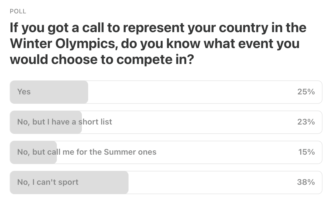
This Week’s Poll:
.
Last Week’s Poll:
.
Data Science Articles & Videos
Why Joins Are Faster Than You’d Expect
Joins are the hardest part of OLAP. Many systems can’t run them efficiently at scale, so teams denormalize into wide tables instead, 10× their storage, dealing with complex stream processing pipelines, and painfully slow and expensive schema evolution that triggers large backfills. StarRocks takes the opposite approach: keep data normalized and make joins fast enough to run on the fly. The challenge is the plan. In a distributed system, the join search space is huge, and a good plan can be orders of magnitude faster. This deep dive explains how StarRocks’ cost-based optimizer makes that possible, in four parts: join fundamentals and optimization challenges, logical join optimizations, join reordering, and distributed join planning…I’m curious how many people had a moment where a concept they once memorized mechanically suddenly made intuitive sense much later — and it changed how they saw the rest of statistics. For me it was realizing that a confidence interval isn’t “the probability the parameter is in the interval,” but a statement about the procedure. Once that clicked, hypothesis testing, p-values, and even power started feeling less mysterious and more like different views of the same machinery…What was yours? A concept that went from “I can compute this” to “oh… I actually get it now,” and made other topics fall into place…
Catalogue of Bias - A collaborative project mapping all the biases that affect health evidence
To better understand the persistent presence, diversity, and impact of biases, we are compiling a Catalogue of Bias, stemming from original work by David Sackett. The entries are a work in progress and describe a wide range of biases, outlining their potential impact in research studies. Sackett recognised the importance of bias in research. His 1979 paper “Bias in Analytic Research”, published in the Journal of Chronic Diseases, reported the first draft of a ‘catalog of biases which may distort the design, execution, analysis, and interpretation of research.’ Sackett catalogued 35 biases that arise in sampling and measurement, in the context of clinical trials, and listed 56 biases potentially affecting case-control and cohort studies…The Day Our Own Queries DoS’ed Us: Inside Zalando Search
Once upon a time, during a normal Sunday, our team ran into an unexpected challenge: an Elasticsearch cluster that suddenly became sluggish and unresponsive due to a self-inflicted Denial of Service (DoS) attack (of course we didn’t know it at the time). This is the story of how we identified, mitigated, and learned from this incident…Visualising income inequality social tables
Visualising income inequality social tables as a scatter plot rather than a dual axis bar/line plot. I use examples from eighteenth and nineteenth century France, England and Wales drawing on Branko Milanovic’s Visions of Inequality 2023 publication…How ClickHouse handles strings
At my work, we use ClickHouse to process billions of records and hundreds of terabytes of data. ClickHouse is fast, and its speed got me curious to learn some of its internals. Let’s look at a few queries:…Inside OpenAI’s in-house data agent
We built our own bespoke in-house AI data agent that explores and reasons over our own platform…In this post, we’ll break down why we needed a bespoke AI data agent, what makes its code-enriched data context and self-learning so useful, and lessons we learned along the way…Mapping building use with a hexagonal grid
I needed a compact way to show the composition of building uses across Spain without pixel‑level clutter. We will aggregate 100 m building‑use rasters to a 20 km hexagonal grid and visualize the mix of agricultural, industrial, and commercial uses with overlapping proportional symbols blended by multiplication…Analysis of 350+ ML competitions in 2025
We analysed trends across hundreds of machine learning competitions that took place in 2025. This report highlights the techniques used in winning solutions…
Women’s Sizing
The inter-generational struggle to find clothes that fit more than a tiny portion of women…Testing for interactions in nonlinear regression
Factorial experiments are very common in agriculture and they are usually laid down to test for the significance of interactions between experimental factors. For example, genotype assessments may be performed at two different nitrogen fertilisation levels (e.g. high and low) to understand whether the ranking of genotypes depends on nutrient availability. For those of you who are not very much into agriculture, I will only say that such an assessment is relevant, because we need to know whether we can recommend the same genotypes, e.g., both in conventional agriculture (high nitrogen availability) and in organic agriculture (relatively lower nitrogen availability)…
What’s the most subtly wrong idea in math? [Reddit]
Within a field of math, something is obviously wrong if most people with knowledge of the field will be able to tell that it’s wrong. Something’s is subtly wrong if it isn’t obviously wrong and showing that it’s incorrect requires a complex, nonstandard or unintuitive reasoning…A framework for making sense of metrics in technical organizations
If you work in a quantitative or technical field, there is little doubt that you or your team has worked long and hard to define which metrics to measure and track. Using data-driven metrics is a critical practice for making rational decisions and deciphering truth in a complex and noisy world. However, as others have pointed out, an over-reliance on metrics can lead to poor outcomes. In an effort to better articulate the value and risks inherent in metrics…I will present a mental framework for thinking about metrics that has helped me reason about their value and risks with a bit more clarity…
.
Last Week's Newsletter's 3 Most Clicked Links
.
* Based on unique clicks.
** Please take a look at last week's issue #638 here.
Cutting Room Floor
Vibecoding #2: I feel like I got substantial value out of Claude today, and want to document it
“Related Post” Data Processing benchmark featuring Rust, Go, Swift, Zig, Julia etc.
flownet: Transport Modeling: Network Processing, Route Enumeration, and Traffic Assignment
.
Whenever you're ready, 2 ways we can help:
Looking to get a job? Check out our “Get A Data Science Job” Course
It is a comprehensive course that teaches you everything you need to know about getting a data science job, based on answers to thousands of reader emails like yours. The course has three sections: Section 1 covers how to get started, Section 2 covers how to assemble a portfolio to showcase your experience (even if you don’t have any), and Section 3 covers how to write your resume.Promote yourself/organization to ~68,750 subscribers by sponsoring this newsletter. 30-35% weekly open rate.
Thank you for joining us this week! :)
Stay Data Science-y!
All our best,
Hannah & Sebastian